fox2263,

Start screens need to do 3 things:

Get you in to the game. Customise the game. Get you out of the game.

I hate screens which have millions of options and areas and ads and words. cough CoD cough

I think starfield looks nice and simple.

ArchmageAzor,
@ArchmageAzor@lemmy.world avatar

I think it looks almost exactly like the menu for Elite Dangerous, and nobody complained about that

GrayBackgroundMusic,

Never, ever take Grummz (former blizz dev who made the comment) seriously. He is a complete garbage can of a human.

Guntrigger,

It looks good. Reminds me of Halo start screens. I wonder if there’s a rousing orchestral accompaniment.

Darkard,

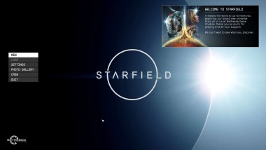
It’s looks like almost any video game ever. Menu, space in the top right for marketing.

Some games put something more visual in the middle. But why does it matter. After playing BG3 for a while I’m just mashing the continue button as soon as it comes up.

hughperman,

any video game ever

In the last 10ish years, more like.

Jamie,
@Jamie@jamie.moe avatar

It just looks like every other Bethesda start screen.

vaultdweller013,

That aint a bad thing, their start screens are simple but functional. Why put too much effort into it when 80 percent of the time it wont even be active for more than 5 seconds. Make it look nice but dont go overboard.

  • Wszystkie
  • Subskrybowane
  • Moderowane
  • Ulubione
  • Pozytywnie
  • krakow
  • giereczkowo
  • Blogi
  • rowery
  • tech
  • Spoleczenstwo
  • niusy
  • sport
  • lieratura
  • esport
  • Cyfryzacja
  • kino
  • muzyka
  • LGBTQIAP
  • opowiadania
  • slask
  • Psychologia
  • motoryzacja
  • turystyka
  • MiddleEast
  • fediversum
  • zebynieucieklo
  • test1
  • Archiwum
  • FromSilesiaToPolesia
  • NomadOffgrid
  • games@sh.itjust.works
  • m0biTech
  • Wszystkie magazyny